Inflation’s (Almost) Roundtrip: What happened, how people experienced it, and what have we learned?
Remarks by CEA Chair Jared Bernstein at the Economic Policy Institute
As Prepared for Delivery
Once again, I thank Heidi and the EPI team for inviting me back to the podium. I also want to thank EPI on behalf of the White House economics’ team for your exemplary work, which, back to the origins of this essential institution, has always focused on economic fairness and the role of power as a determinant of economic outcomes, a view that neatly syncs up with our worker-centered agenda in the Biden/Harris administration.
I warn you, with apologies, that this speech goes on a bit longer than average, but I’ve done extensive field testing, and everyone so far has found it riveting.
As we are now getting close to inflation completing a round trip from its pre-pandemic pace, through its pandemic high, and back again, this seemed like a good time to take a stab at the question: what was that all about?!
Today, I’ll speak on three related topics. First and foremost, what’s the best explanation for inflation’s rise and fall, as shown in the first slide? Do economists, as some have suggested, need a new set of models to explain what happened? Second, how did people experience inflation’s almost-round trip? And third, what are the policy lessons from this episode, and how are we in the Biden/Harris administration applying them both in the near-term and processing them in the longer-term for the next time we face a shock to the overall economy.
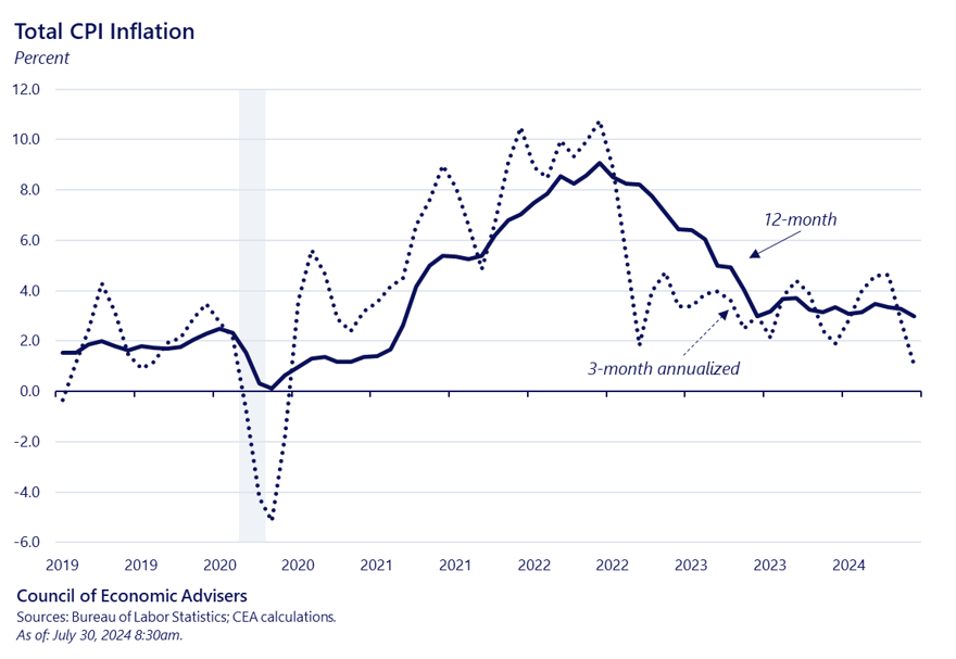
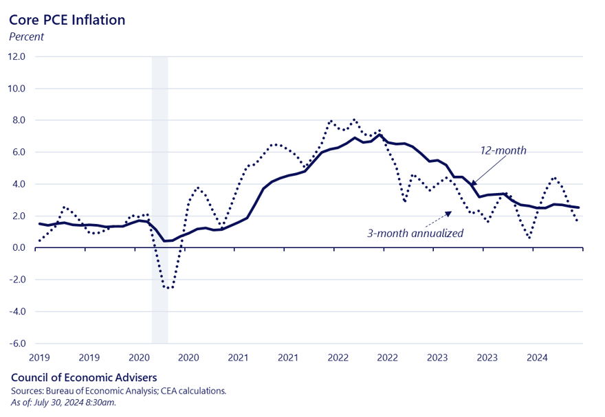
Starting with “what happened?”, consider the CPIs rise and fall in both year-over-year and on an annualized quarterly basis, included to show near-term dynamics, which are always very important to us in the White House. Disinflation took hold in the second half of last year, but appeared to stall in first few months of this year. More recent inflation prints, however, appear to confirm CEAs view that the Q1 pause was just that, and that the forces of disinflation—forces which I will explore in detail today—remain in play and can be seen by their good works in more recent prints.
In a recent podcast with Soumaya Keynes of the Financial Times, Minneapolis Fed President Neel Kashkari, gave such a clear answer to the question of what drove inflation up and then down that I don’t think I can improve on it.
Neel argued that the pandemic led to a situation wherein strong demand collided with weak supply, pushing up inflation across the globe. Nuances abound, but that simple formulation is the right place to start.
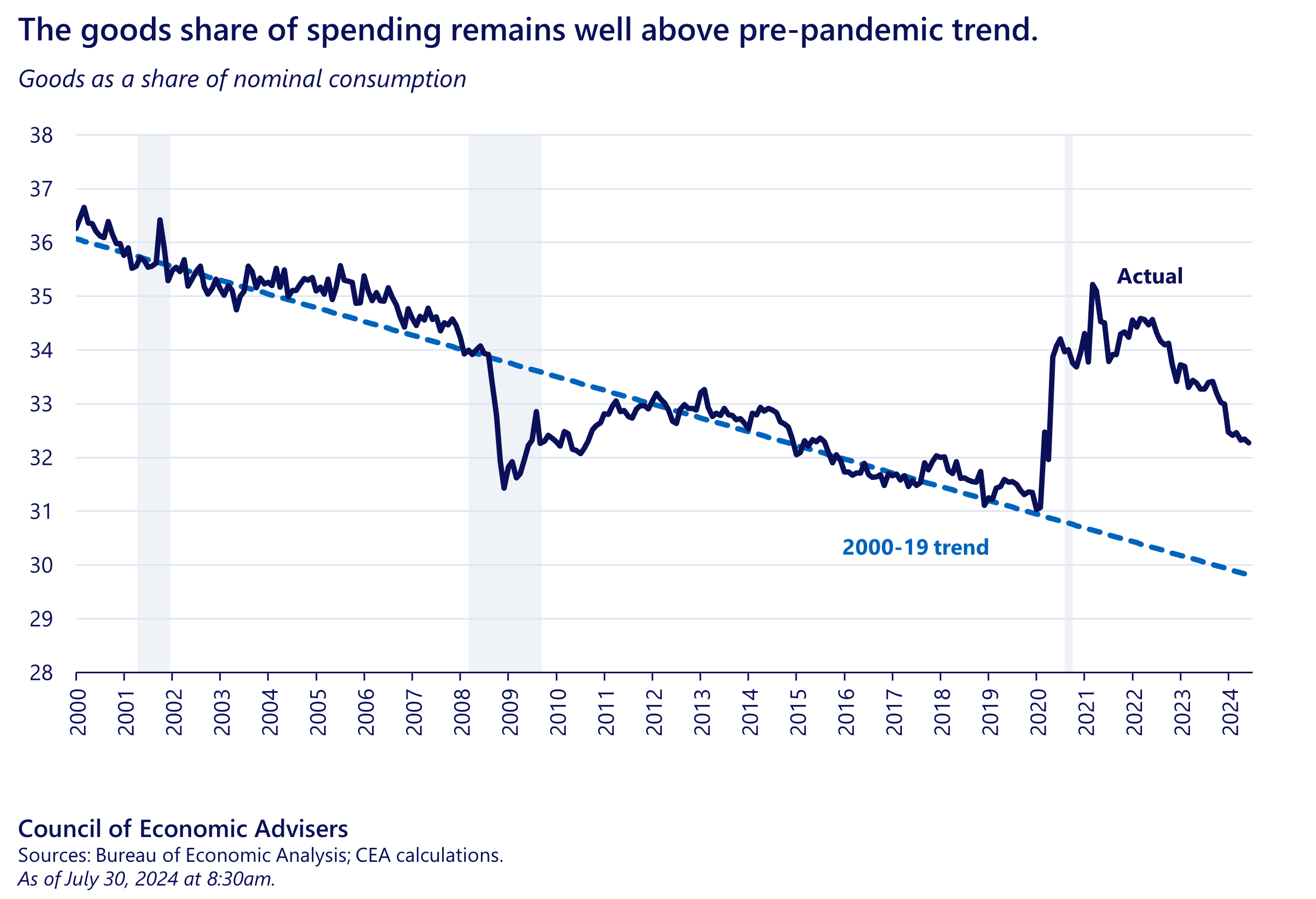
He stressed that when the pandemic hit, consumers’ engagement with in-person services largely shut down. The savings that resulted from that impactful change, in tandem with fiscal and monetary policy support, meant people had more disposable income. At the same time, the demand for goods rose sharply, as shown in the next slide, and in fact goods spending as share of overall spending remains elevated relative to its 2000-2019 trend.
Neel also referenced the February 2022 invasion of Ukraine, further shocking supply in the key commodity markets of energy and food. As we know, energy shocks can negatively impact production and bleed through to higher prices across the whole economy.
If those factors—strong demand colliding with damaged supply, amped up by the consumers’ composition demand shift and Putin’s invasion—explain the upslope of the roundtrip, what explains the downslope?
An obvious answer is the unwinding of the forces pushing inflation up, meaning unsnarled product and labor supplies, leavened with some normalizing of demand. Add in the important contribution of anchored inflationary expectations, which, as CEA has argued, is attributable to a credible, independent Fed.
Of course, in terms of economic impacts, it matters a great deal how those forces are apportioned in terms of lower inflation. I can tell you that President Biden emphasized to us early on the importance of maintaining a low sacrifice ratio, which he framed as not dis-inflating “on the backs of working people.”
Well, we’ve now seen 6 percentage points of yearly headline CPI disinflation since June 2022. In that month, the unemployment rate was 3.6%. It is now a half-point higher, meaning we have been in a world with a very low sacrifice ratio. We see that in this next slide, the often-cited Beveridge curve figure (updated this morning!), where the black dots show cooling labor demand through the diminished-vacancy channel vs. higher unemployment.

But I suspect you haven’t seen this next set of slides, an animated version of the roundtrip, assembled by our CEA staff using MSA level data in Phillips-curve space. The gray triangles in the background just show the well-established quite flat price Phillips curve that prevailed pre-pandemic. As we click through, extending the sample (note how the legend updates), and the dynamics of strong demand plus weak supply take hold, we see an important non-linearity take shape, first in the open circles and finally in the dark diamonds. With the sample extended through the first half of 2022, we see peak MSA inflation, and of course this is when the national CPI peaked at 9%, in June of ’22.
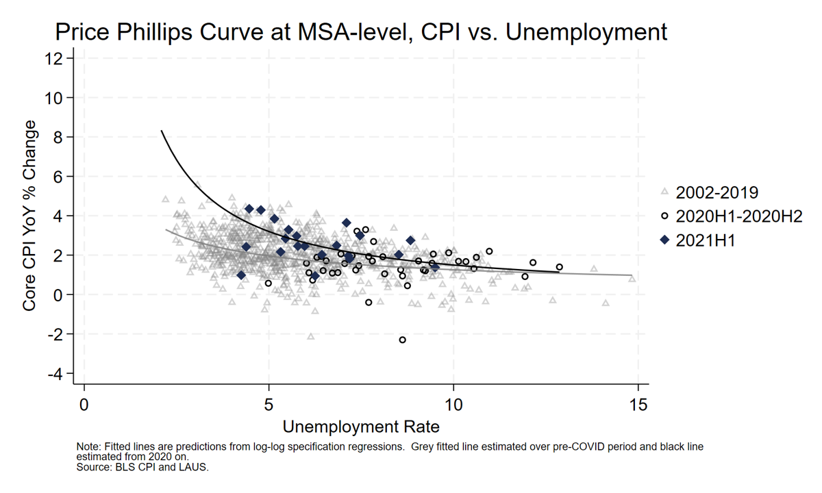
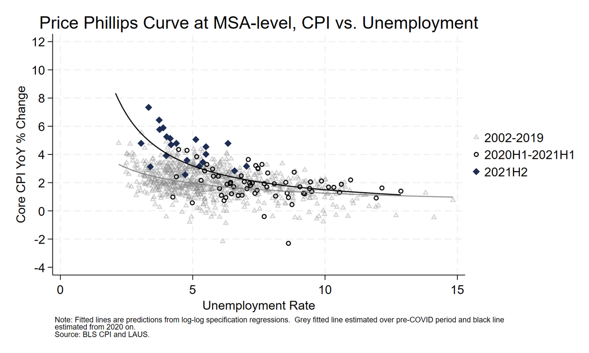
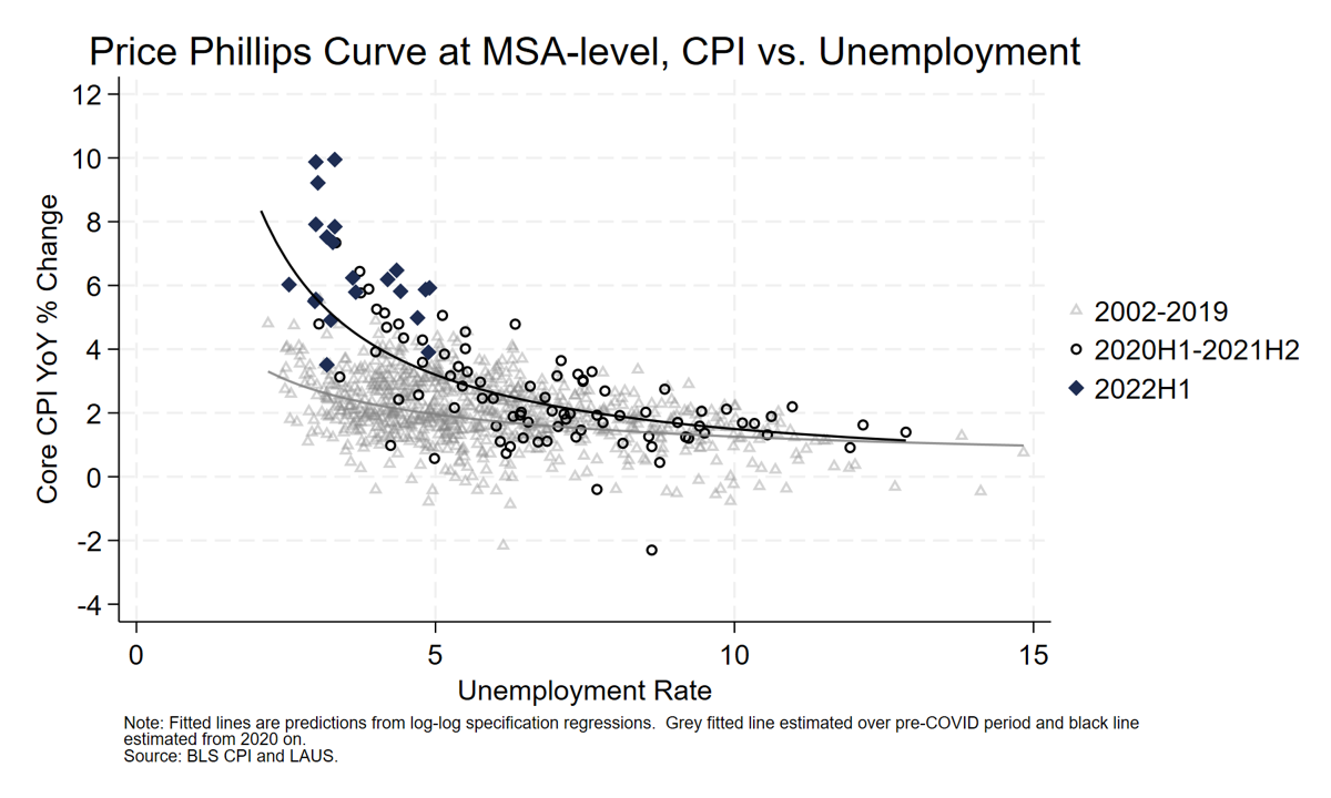
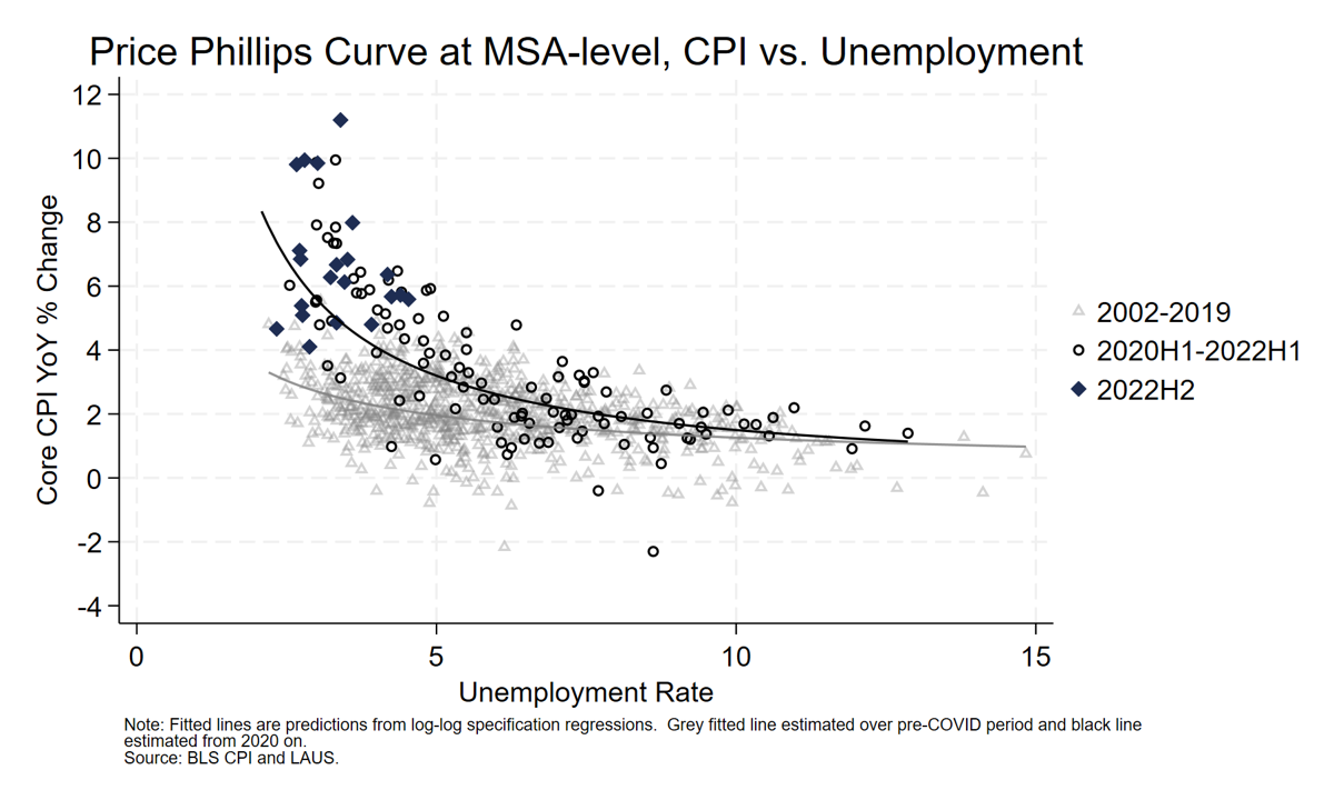
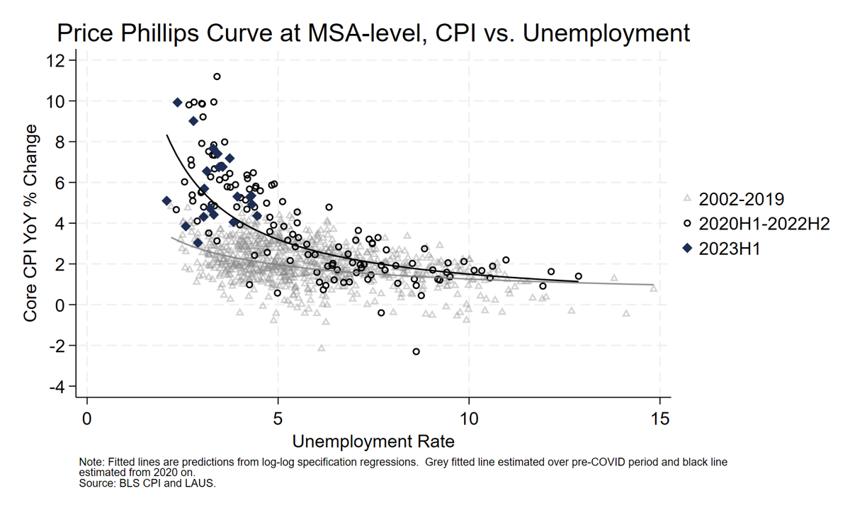
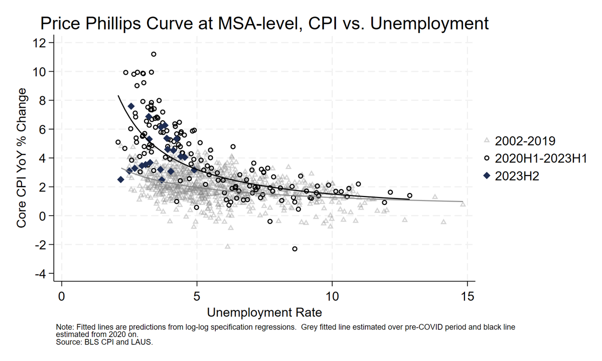

As we proceed next to the disinflationary period in the latter half of ’23, we see the dark dots start to “climb down the wall,” as it were. The final sample period extends through ’24 first half, and, as with the national inflation data, you see the roundtrip not completed by well underway.
A close shave with Occam’s razor is helpful here. This much disinflation without much demand destruction implies improved supply conditions played a significant role in both the rise and fall of inflation. Moreover, the pre-pandemic gray triangles show that we get a bit on non-linearity in the price curve at low unemployment, but when you add a large supply shock, the convexity is highly amplified. This strongly suggests not just movements along a curve, but supply-shock-driven intercept shifts rather than only tight labor markets.
At CEA, we developed a model, or, more precisely, augmented an existing model, to explore just these dynamics.
We start with a standard Phillips curve model used by Janet Yellen from a 2015 speech she made when she was still chairing the Fed. The model predicts core PCE inflation as a function of labor-market slack, import prices, and inflation expectations.
Such a model fits the data pretty well in normal times with no significant shocks to the economy’s supply side. But as CEA wrote in 2021, when thinking about the historical comparisons for the current bout of inflation, the period after WW2 seemed most analogous, a period we characterized by “supply chain disruptions and a spike in consumer demand after a period of temporary suppression.” Inflation that was largely supply-driven seemed like the right framework. So, we tweaked the Yellen model to include measures of supply shocks. I should note that this line of thinking tracks the recent Bernanke/Blanchard modelling in an influential paper covering similar material.
This crowd will recall the depth of the pandemic-induced supply shock. Key ports became maritime parking lots, container dwell times spiked, and shipping costs rose by a factor of 10 above 2019 levels. A major shortage of semiconductor chips caused surging car and computer prices at the same time that consumers were undergoing the “rotation” from services to goods that I highlighted a moment ago.
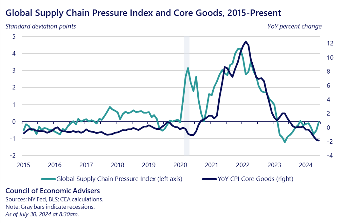
We thus augment the Yellen model with a measure of supply chain disruptions, using the NY Fed’s Global Supply Chain Pressure Index which compiles data from surveys of businesses, indexes of shipping costs, and commodities prices. And you can see from the next slide, this index tracked goods inflation well over the last several years, a first-pass indication that its inclusion in the augmented model made sense.
Because it was snarled supply plus strong demand that explains “what happened,” a natural variable to include in the model is the interaction between the supply-index and slack. This helps to capture the point that fast-moving shocks along with nonlinear supply curves can themselves lead to the nonlinear inflation dynamics we just saw in the animated MSA slides.
An easy way to see this is to run the model with and without the supply-side variable and its interaction with slack. These next slides decompose excess core PCE inflation in both the plain vanilla and augmented models. In the first slide, you see large residuals suggesting unexplained variation and a potentially omitted variable.
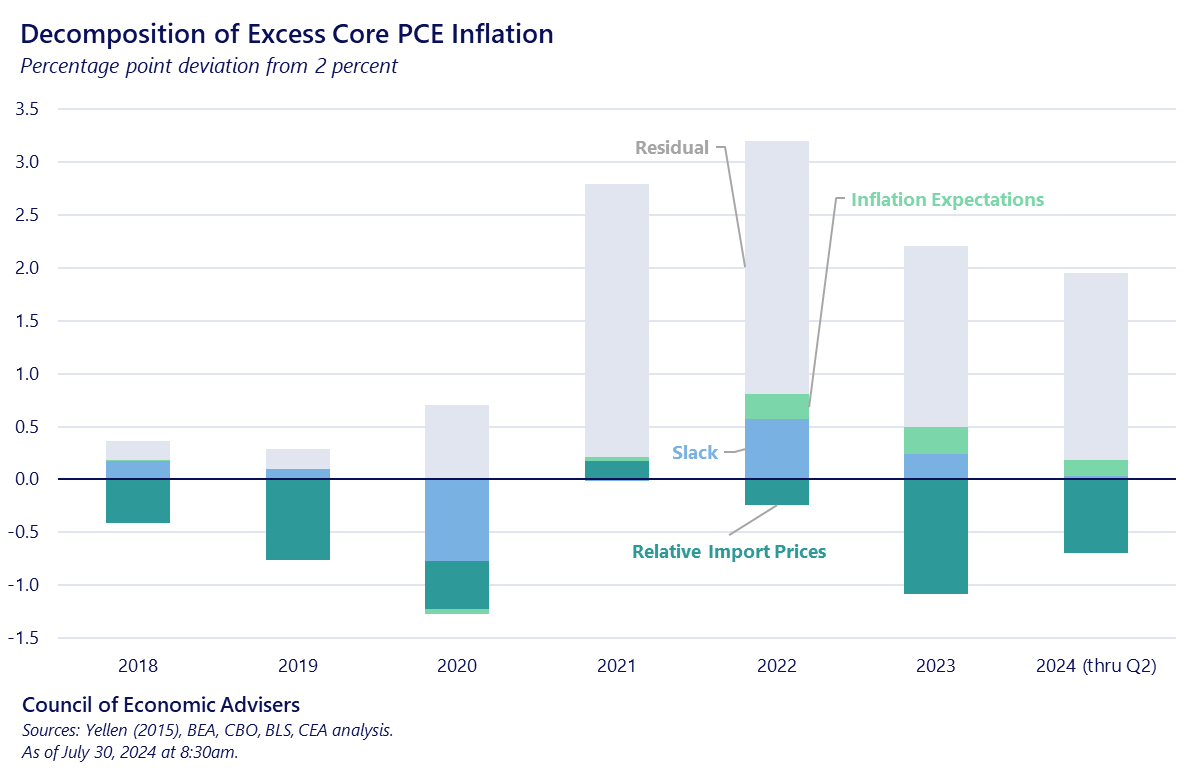
In the next slide, which uses the augmented model, the residual part of the bars shrinks significantly, underscoring our argument that rather than a full suite of new models, we need to fix an omitted variable problem.
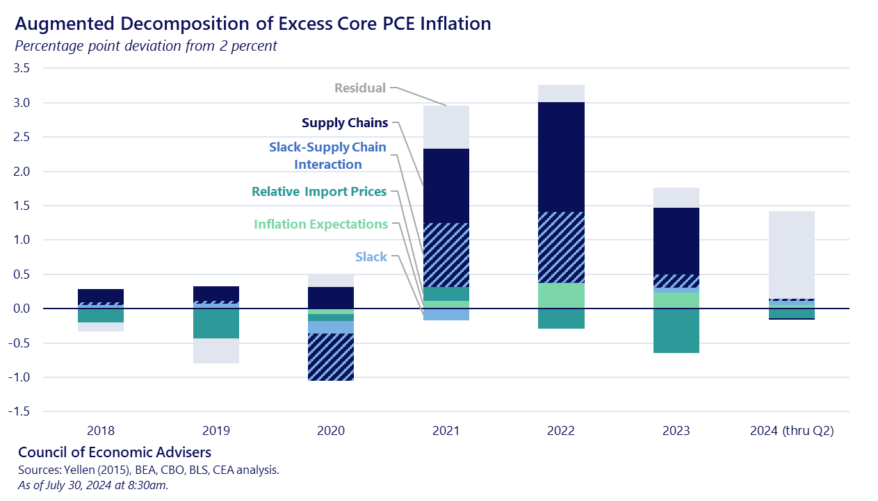
This little table forms the punchline of the “what happened” part of my talk. It shows the percentage point decomposition of excess core PCE inflation over both the inflation and disinflation periods. The vast majority of the action is not in the slack variable itself; it’s in the supply variable and the supply/demand interaction variable. And adding their contributions together reveals that their impact climbing up the mountain was quantitatively the same as their impact climbing down.
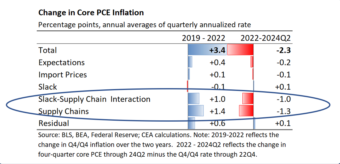
So, collecting findings thus far, CEAs view is that there’s still a relationship between unemployment and inflation, but a), supply shocks—in this case, a large shock to the commodity sector—shift the curve, b) even without shocks, it’s likely non-linear—the coefficient on unemployment is larger—around full capacity and c), it is a function of not just demand shocks, as we’ve long had in the model, but of supply shocks, which most of us have not always explicitly modeled.
Before concluding the “what happened” part of our discussion, let me say a few words about another part of the story: elevated markups in some sectors, profitability, and insufficient competition.
Once again, it all starts with the pandemic, and the collision of strong demand and snarled supply. The ensuing misalignment leads to higher input costs which are passed through to consumers, whose savings and incomes were elevated due to their sharply reduced spending on in-person services and fiscal support, rendering them less responsive to price increases.
Isabella Weber has written extensively about this process, often under the Abba Lerner label of “sellers’ inflation,” wherein producers engage in an “implicit agreement” coordinated by the shock to raise prices. As Weber puts it: “sellers’ inflation happens when the corporate sector manages to pass on a major cost shock to consumers by increasing prices to protect or enhance its profit margins.” For evidence, she listens in on earnings calls around this period, where executives where upfront about tapping these dynamics to raise prices and boost markups.
Before she joined the administration, my colleague NEC Director Brainard discussed similar dynamics in what she called “price-price inflation.” She distinguished this type of inflation from “wage-price” dynamics, writing in early 2023 how “[r]etail markups in a number of sectors have seen material increases in what could be described as a price–price spiral, whereby final prices have risen by more than the increases in input prices.” In Weber’s sequencing, this is the “amplification stage,” wherein some firms realize they can flex a pricing power they’ve lacked for decades and push prices beyond what’s needed to cover higher input costs. Labor may fight back, as in older conflict models, but who prevails, as Weber correctly posits, “depends on power relations in the economy.”
Other factors behind margin elevation include the flattening of price elasticity of demand, such that the old adage “the cure for high prices is high prices” is temporarily disengaged, as well as insufficient competition. With these factors in play, the sequences outlined by Brainard or Weber generate higher prices that go beyond input cost increases, to higher profit shares and squeezed labor shares. Given that inflation’s round trip is not yet complete, a relevant fact to draw from this part of our journey, one stressed by EPI’s own Josh Bivens and our own Mike Konczal, is that a rising, or what we might call a normalizing, labor share can be a source of non-inflationary wage gains.
Manuel Abecasis from Goldman Sachs alludes to this “last mile” question though an analysis of why profit rates and markups remained relatively high this year, especially given normalization of supply chains and accompanying disinflation. One candidate that we in the Biden administration take seriously is industry concentration, which serves as a margin-insulation buffer against the usual pattern of margin normalization as scarcity economics fade.
Abecasis also documents rockets and feathers in play: input cost increases raise prices more quickly than input cost declines lower them. But he also finds that sectors with the highest markups and now those who are normalizing most quickly. Another interesting finding from this work is that for industries facing more import competition, markups normalize most quickly.
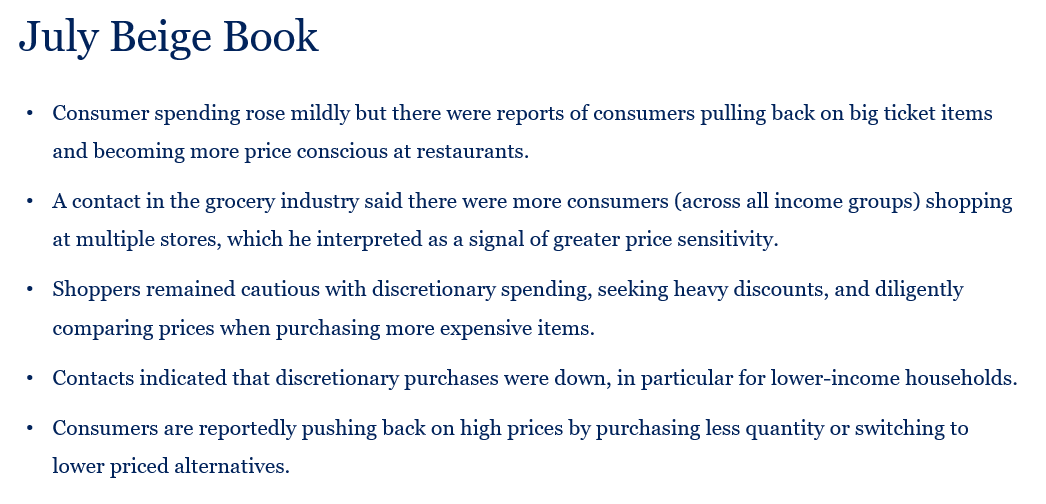
There’s one other important factor from this markup analysis, alluded to above, that we believe will help complete the roundtrip: the return of price sensitivity. As excess savings have largely burnt off, even as real wages and disposable incomes are posting solid gains, the price elasticity of demand appears to have reawakened. The Fed data from the Survey of Household Economic Decision Making shows some evidence of individuals at the lower end of the income distribution becoming increasingly price sensitive, while the Fed’s Beige Book is reporting more statements like those on this next slide.
Summarizing, we don’t need high markups to explain how and why inflation took off, but the conditions that existed in ’20 and ’21 gave certain firms the ability to flex a pricing power that was much less prevalent pre-pandemic. Working through this literature, I was reminded of the importance of President Biden’s Competition Council and of the FTC’s work in this space.
Old EPI’ers like me remember Dean Baker’s refrain in many a meeting back then, a refrain that was applied when a mainstream economic principle was helpful to regular folks: “Let’s be good neoclassical economists.” Economists all the way back to Adam (Smith, of course), recognized that absent adequate competition, price signals will be unable to work their magic, margins will get fatter, and consumers will literally pay the price.
Everything I’ve discussed thus far fits squarely within the purview of familiar analysis by macroeconomists. But this next part is newer, and it is one that has absorbed a great deal of time and thought at the Council: How people (as opposed to economists) experienced inflation over this period.
It’s a fascinating and, especially from the White House perspective, important question, one involving concepts more comfortable to psychologists than economists, like vibes. But at risk of reductionism and oversimplification, I’ve found it useful to start from this truism: economists obsess over rates; regular people obsess over levels.
All else equal, someone should be indifferent between today’s price and wage and a future price and wage that are both 10% higher. But all else isn’t equal in the eyes of many consumers. As economist Stephanie Stantcheva has shown, folks tend to feel that while they earned their wage gains, price hikes happened to them, the result of forces out of their control. If so, then those two situations may produce equal buying power but they don’t produce equal vibes.
And in my job, vibes matter.
That also means that disinflation, while surely welcomed, must be distinguished from deflation. A central banker wants inflation to get back to target. A shopper wants his or her old price back.
Here’s how we’ve thought about this at CEA. People carry around “PPVs” in their heads, or personal price vectors. That is, they roughly remember a set of prices of things they purchase repeatedly. Gas and groceries, of course, but the “personal” part of the PPV means that the vector is bespoke. An element of a parent’s PPV might include a meal out with the kids at a family restaurant they regularly frequent. For a gardener, it might include a bag of fertilizer; for someone who regularly travels, a hotel room.
Because of normal variation in prices, somebody’s PPV is always getting tweaked, in either direction. But as long as the diffusion in the broad set of prices stays relatively low, as indices from the San Francisco Fed showed to be the case pre-pandemic, you didn’t have a lot of people experiencing disconcerting PPV disruption. But when a larger share of prices trends up, a lot more PPVs get hit, and vibe disruption ensues.
The key question then becomes what will it take for people to feel better about prices. Elevated price levels can’t be the whole story. When I started driving, gas cost about $0.60/gallon. But I don’t walk around permanently depressed by that long-ago price. In fact, we believe at least three things have to happen for sentiment around prices to improve.
First, let me be clear: disinflation, not deflation, is not immaterial to this adjustment; it is crucial. Resetting and maintaining PPVs requires slow enough inflation such that price levels are moving relatively marginally. This insight relates to an explicit goal of central banking dating back to at least the Greenspan era: keep inflation low enough that people don’t have to think about it.
Second, wage and income growth must exceed price growth such that pre-shock buying power is restored. This next slide shows a few examples of how that part of the solution has been solidly underway for a while now, a fact that Elise Gould and others here at EPI, have helpfully demonstrated in a series of papers. The slide shows three different real gains: mid-level hourly wages, disposable income, and compensation per person. Each one shows elevated buying power.
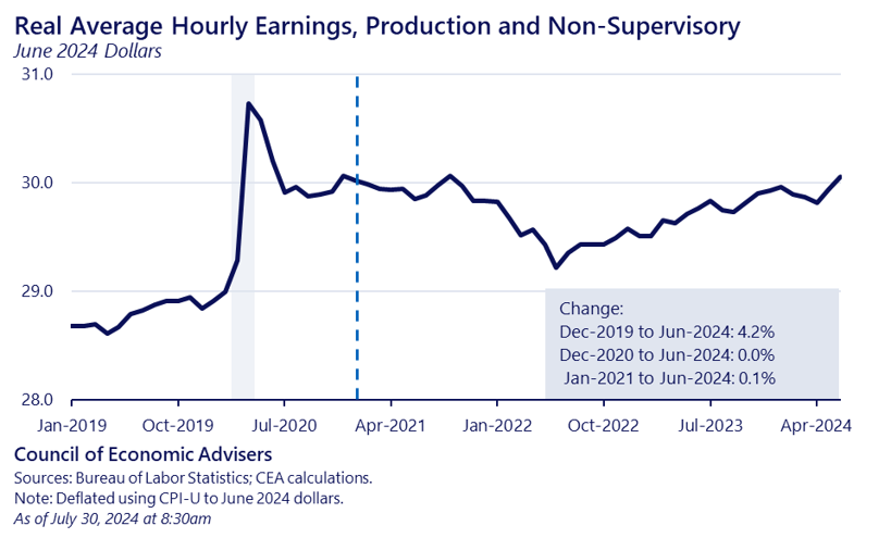
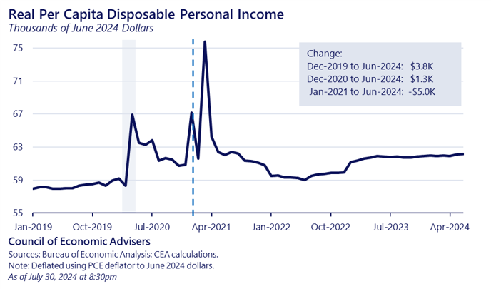
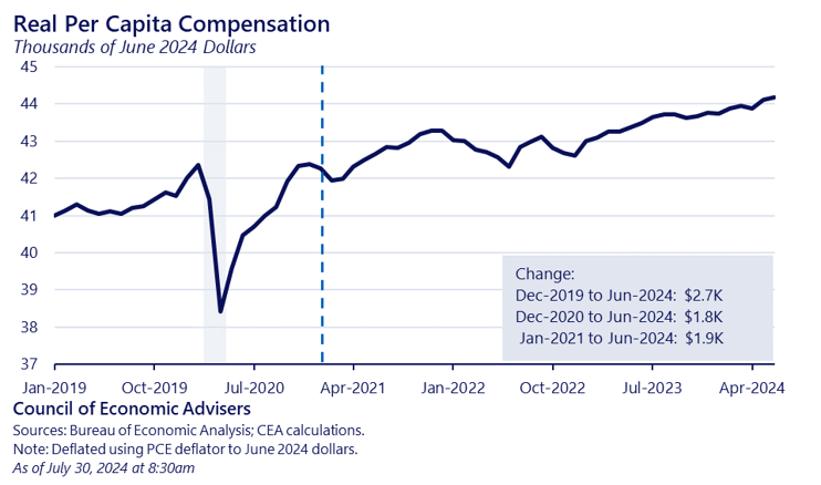
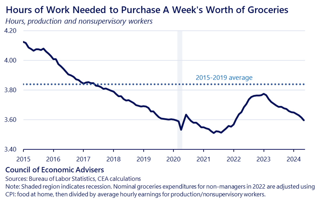
In other words, both steps one and two are currently very much in train. One way we track this at CEA, as shown in the next slide, is to calculate how many hours of work it takes for the average, middle-wage worker to afford a bag of groceries. In fact, that number of hours is about the same now as it was before the pandemic. To be clear, normal people don’t make this calculation, but it is a necessary, though not sufficient, part of the solution.
Third, enough time must pass for people to update their PPVs. At this point, some invariably asks “how long is that?” The answer is no one knows, though economists Ryan Cummings and Neale Mahoney took a deep dive into the question. They conclude that “the impact of inflation on consumer sentiment fades out with a decay rate of about 50 percent per year, with a 10 percent inflation shock reducing sentiment by 35 index points in the current year, 16 index points the following year” and so on. In other words, with steps one and two in place—disinflation and real wage gains—it probably takes people a couple of years to reset their PPVs.
Another timing factor possibly in play here comes from recent Fed research showing peoples’ perceptions of inflation can be asymmetric: tracking actual inflation fairly closely on the runup but slower to believe that disinflation is underway. Evidence also suggests that an increase in negative reporting on these issues by the media—another asymmetry—may also be in the mix.
Summarizing, vibes matter, and economists risk talking past people if we fail to recognize that both inflation rates AND price levels matter. We’re acutely aware of this in the Biden/Harris administration and it is a key reason for our cost cutting agenda that I’ll turn to as I conclude this roundtrip journey.
I’ve tried to highlight lessons along the way, but let me offer a quick roundup of what we at CEA have learned from this roundtrip:
–Many progressive, full-employment-oriented economists have long focused on structural output gaps and how u*–the lowest unemployment rate consistent with stable inflation—was over-estimated. We’ve made great progress in convincing our brothers and sisters of this case and of the importance of high-demand, full employment economies. For the record, President Biden has known this for a long time.
But one lesson from the pandemic is we mustn’t lose sight of the economy’s supply side. As seen in our augmented price PC model, negative supply shocks can be highly consequential, particularly amidst strong demand, where we’ve seen how their interaction can generate a steep non-linearity.
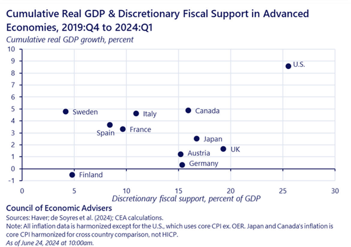
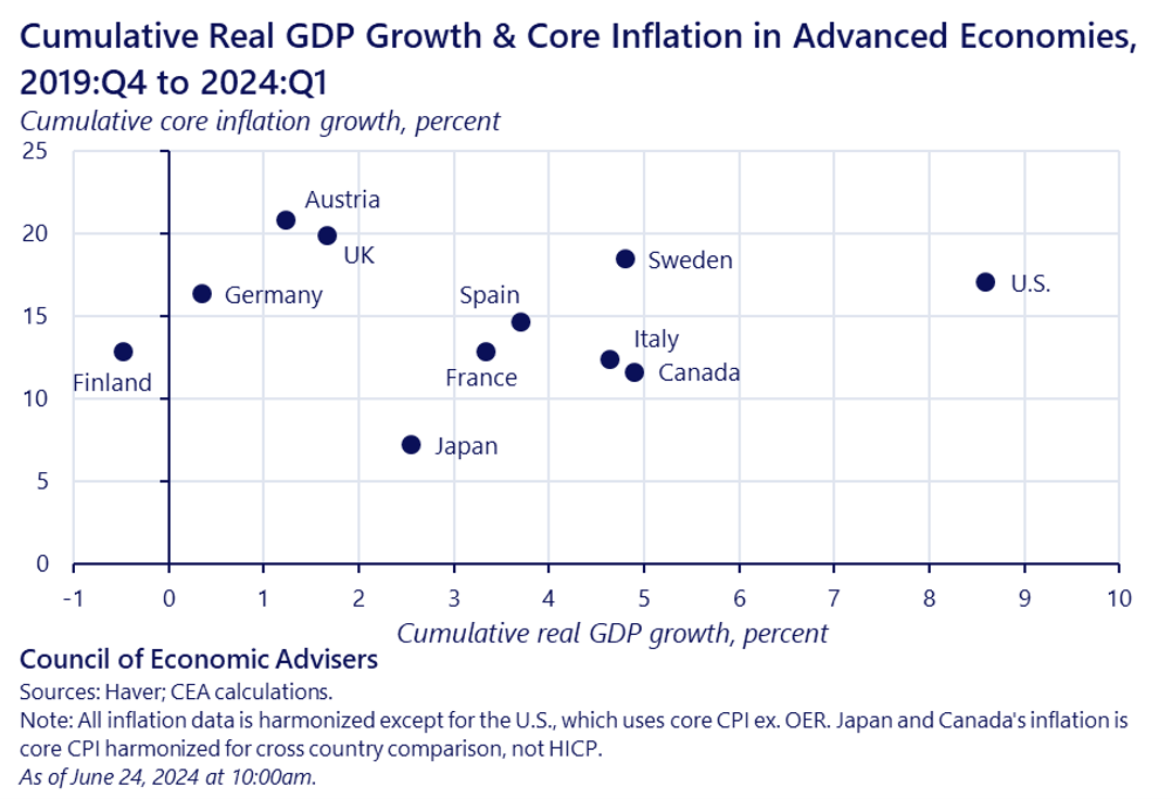
–That said, policy makers should not take the wrong lesson from the fiscal response to the pandemic: that hitting back hard against a massive shock is ill-advised due to inflation risk. That’s not at all what the data show. I think these three international comparison scatterplots are instructive in that regard. The first slide shows how the US fiscal policy hit back a lot harder than the other advanced economies in the slide, and partly in result, saw much stronger real growth (though, of course, these countries tended to be more exposed to Putin’s invasion of Ukraine).
The second slide shows, however, little correlation between the fiscal response and cumulative inflation.
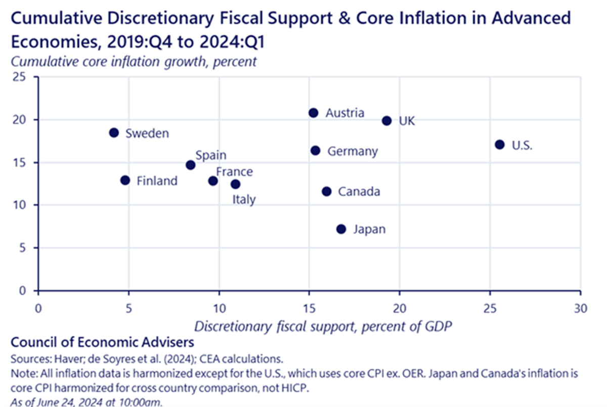
And the last slide—the punchline, if you will—shows how we ended with more growth, but not more inflation. To me, these slides confirm one of the most important lessons from the pandemic: by punching back hard against a large, global shock, we can avoid a lot of unnecessary economic pain, the lasting damage of economic scarring, business failures, and living standards reductions.
And these slides, with their focus on purely macro-variables, don’t begin to get at the far-reaching benefits of the Biden/Harris administration’s Rescue Plan, and the extent to which it helped cut child poverty in half in 2021, reduced racial disparities in unemployment, wages, and net worth, got shots in arms and checks in pockets to help families and business get to the other side of the crisis, prevented evictions, helped to stabilize the child-care market, preserved union pensions, gave local schools resources to help them get through the crisis, and so much more.
–Another lesson is the importance of ample competition at the industry level, so as to prevent a lasting upward shift in inflation-sustaining markups in the midst of a supply shock accompanied by strong demand and diminished price sensitivity.
–Finally, price levels matter a great deal. We believe there’s a process underway whereby people acclimate to impact of the shock on prices, though significant disinflation—check—higher real incomes—check—and enough time to reset their PPVs—in progress.
One way we in the Biden/Harris administration are trying to help accelerate this process is through an aggressive cost-cutting agenda. Some of our efforts have been directed at lowering prices that are the most salient to family budgets, including gas, food, health coverage and prescription drugs. Others have been in the competition space, which I’ve argued is key to addressing sticky prices. Others have attacked nuisance and junk fees, which I’ve come to view as non-trivially corrosive to both economic fairness and price signaling.
There are two areas of critical, unfinished business in this cost-cutting space, ones to which the president and vice-president are absolutely committed: affordable housing and child care. Each deserves its own speech, but we have long had highly effective policies to both significantly increase the stock of affordable housing and reduce the share of income that families have to spend on high-quality child care. Both plans require Congress, but there is every reason for these to be bipartisan policies. I don’t care if you’re in a red, blue, or purple state; you need a lot more affordable housing and child care.
With that, let me thank you for allowing me to be your group leader on our journey through this almost roundtrip, and I look forward to your questions.
