The Signal and Noise in UI Claims
The labor market has continued to be remarkably strong during the post-COVID recovery, posting 27 consecutive months of sub-4% unemployment, more than a 50-year record. Wage growth for mid-wage workers has outstripped inflation over the last 13 months on a year-over-year basis. And in turn, both of these forces have helped maintain strong consumption growth, which has averaged a healthy 2.4% over the last four quarters.
In this blog, however, we focus on a different measure of labor market strength, one which is right under our noses every week but is easy to overlook: unemployment insurance (UI) claims data. UI claims data consist of two primary series. One, initial claims for UI, which gives the number of individuals newly claiming unemployment benefits, i.e. the flow into unemployment insurance. Two, the number of continuing claims for UI, which is roughly the stock of individuals receiving UI benefits.[1]
With lots of data pointing in the same direction of a strong economy, one may be left wondering why it makes sense to hone in on these series. The UI data have two primary features that make them important gauges of the strength of the labor market. First, UI data are released on a weekly basis, providing a glimpse of the state of the labor market in a more-timely fashion than some of the less frequently-released data. This is why weekly initial claims are sometimes referred to as “the canary in the coal mine” of the labor market in the sense that they provide timely information about rising layoffs. Second, because UI data are drawn from administrative records, they can offer a reliable alternative gauge of underlying trends in the labor market when other data, such as from the Current Population Survey, can be especially noisy. These features of UI data allow us to gain a richer understanding of the economic environment and more confidence in our assessment of where the economy is headed.
Long-run Trends in UI Claims
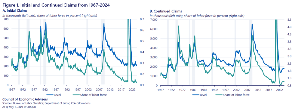
The exceptionally strong demand for workers over the last couple of years has kept layoff rates low. And those workers who do experience a spell of unemployment are able to find new jobs relatively quickly. Thus, it is not surprising that UI claims have been low relative to historical standards in recent years, as shown for initial claims and continuing claims in the left and right panels of Figure 1, respectively. [2]
The strikingly low level of claims in recent years is even starker when considering that the labor force has been growing over time; the ratio of UI initial claims to the labor force is given by the green line in the left panel, which is now close to its lowest level in the series.[3]
The same story is true for the number of continuing claimants, which has been hovering around 1.8 million over the last year, about the same as in the two years prior to COVID. In fact, over the last two years, both initial and continuing claims have been, on average, below the 2018-2019 average.
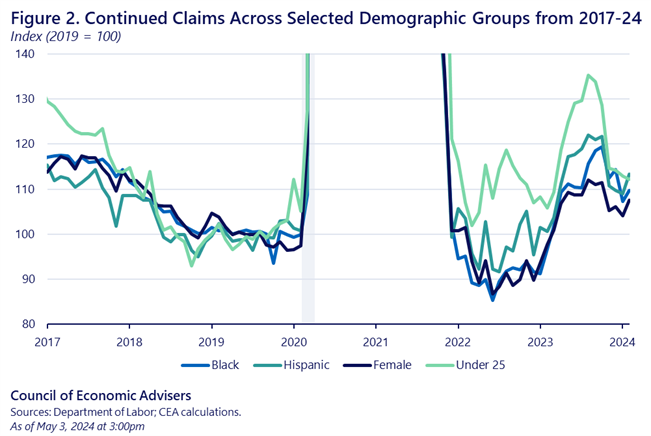
The recent low readings of UI claims have been reflected across a wide set of demographic groups. For example, though they’ve come up slightly over the past year, continued claims remain low for female, Black, Hispanic, and young workers, groups that have historically had higher average unemployment rates than the overall population. This is consistent with the evidence on the benefits of full employment that was the topic of chapter 1 of the 2024 Economic Report of the President.
Unemployment Insurance Claims Data Provide Timely and Accurate Labor Market Assessments
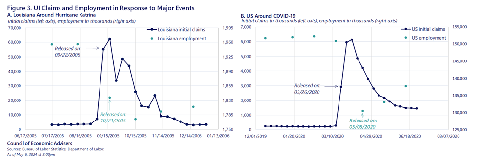
The timeliness of UI data can help analysts get a bead on sharp economic shifts before the monthly employment report. This was true at the onset of COVID when analysts followed each week’s claims data very closely prior to the BLS releases of the jobs report.[4] This is also true during natural disasters, for example in Louisiana in the aftermath of hurricane Katrina. Figure 3 shows claims and employment in the weeks surrounding both of these events, with Katrina on the left and COVID on the right.
The spike in claims occurred immediately after Katrina (which made landfall at the end of August 2005), and initial claims in Louisiana registered a roughly 48,000 increase (up from about 3,500 two weeks prior) in the data released on 09/22/2005. It wasn’t until a month later on 10/21/2005 the state-level data became available for employment from the Current Employment Statistics data, which showed that non-farm payroll employment decreased 129,000 over the month.
The same was true during COVID which is shown in panel B of Figure 3. When large-scale economic shutdowns began in the middle of March 2020, there was vast uncertainty as to the degree of labor market damage that would occur. The first read as to the magnitude of the effects was given by the UI data released on March 26th for UI claims (for the prior week), which showed a historic rise of nearly 3 million in UI claims. Because the reference periods for the Current Population Survey and the Current Establishment Survey are roughly in the first half of the month, the employment situation report for that month (released in early April) did not capture the true scope of the shutdown. It wasn’t until May 8th that the employment report for April showed that payroll employment had fallen by around 20 million. UI claims were therefore an indispensable gauge of the economy in the initial weeks of the COVID recession.
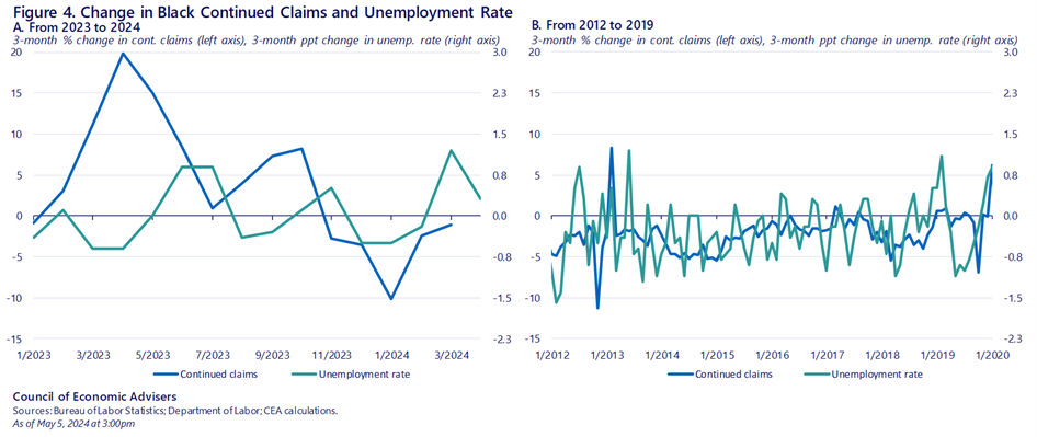
Second, UI claims data are based on administrative data and can help to elicit the signal from the noise inherent in the household survey estimates (or from other sources) which are based on a relatively small sample. For example, the Current Population Survey is a sample of about 60,000 households per month and therefore is subject to substantial sampling variability.
One example from recent months is that the unemployment rate for Black workers increased from 5.2% in December to 6.4% in March before retreating back to 5.6% in April, as shown in the left panel of Figure 4. Analysts who were worried about the rise in Black unemployment could also look to UI claims by demographic groups (which, unlike aggregate claims data, does lag the jobs report by several weeks). The claims data did not show a comparable increase in Black UI claims. The panel on the right gives a hint for why using data from 2012-2019: the Black unemployment rate (green line) is far more volatile than for Black UI continuing claims (the blue line).
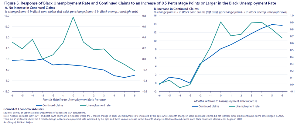
Another way to see this idea is in Figure 5 which shows what happens with Black unemployment from the CPS and Black UI claims in the six months before and after the Black unemployment rises by 0.5 ppt over three months (roughly the median three-month increase). The two panels restrict to different behavior of UI claims. On the left, we condition on no increase in claims over the same three months. On the right, we condition on an increase in UI claims at the same time.
We can see that in the instances in which the Black unemployment rises without an attendant rise in UI claims, the unemployment rate on average returns to its baseline after four months and there is little change in claims throughout the whole period. However, in the cases in which claims and unemployment both rise (on the right), we see that after six months, both have moved up notably. In other words, looking at continued claims over the same period alleviates the challenges of small samples sizes, and it can help distinguish rapid changes that are likely statistical noise or otherwise temporary from more persistent changes in unemployment.
In summary, we often think of our UI system as a critical safety net: an aptly named, vital form of insurance against unemployment, when workers lose jobs through no fault of their own. This is, of course, it’s most important role. But it is also a high-frequency data source that labor economists use to track to labor market conditions, and in this regard, provides another confirmation, from an independent data source, of the uniquely strong U.S. job market.
[1] To qualify for unemployment insurance an individual, among other stipulations, must have lost their job through “no fault of their own” and be actively seeking work while collecting benefits. The benefit replaces about half of their previous earnings below the maximum benefit amount. The average benefit before 2020 was about $387 a week.
[2] In addition, part of the declining trend in UI claims is due to a long-run fall in layoff rates that has occurred over the last several decades (Crump et al., 2019). There are also programmatic and institutional reasons why claims for UI have secularly declined. Some states have cut program eligibility in recent years, for example reducing benefit durations and benefit generosity. These factors have implications for interpreting the series over the long run, although we do not believe that these factors rule out using long-run trends in UI claims as a useful barometer. In addition, movements in UI claims over short periods of time are likely less influenced by these factors.
[3] UI played an especially important role in the labor market during COVID, with the program providing an unprecedented amount of benefits to Americans (Pandemic’s $794 billion unemployment benefits were historic. Here’s why (cnbc.com) and https://crsreports.congress.gov/product/pdf/IF/IF12143). However, in this blog we will focus on long-run trends as well as recent data since 2023.
[4] For example, see Faberman (2020): Predicting the Unemployment Rate in a Time of Coronavirus – Federal Reserve Bank of Chicago (chicagofed.org) and Cajner et al. (2020) Reconciling Unemployment Claims with Job Losses in the First Months of the Covid-19 Crisis.
